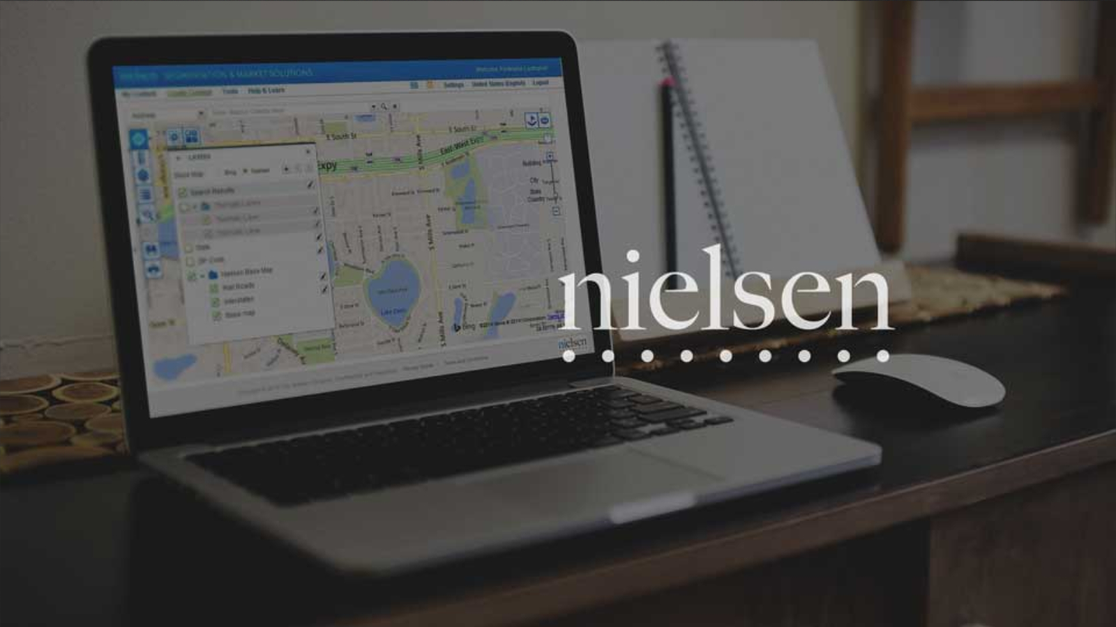
Nielsen
UX Architect

When I tell people I worked at Nielsen, the response I usually get is, "oh the TV ratings people." While it is true that they are the "TV ratings people," a more accurate description of them would probably be the consumer data people. If you need help deciding where the best location to open a new store is, or what demographics might be interested in your product Nielsen has the data to help answer those questions.
My Role
Data doesn't do you any good unless you can interpret it. And that is where I came in. I worked as part of the team tasked with developing the tools to allow users to analyze and understand data. The team I joined was part of a mature user experience design practice, one that I would describe as 'doing it the right way." With data being at the core of Nielsen's business, it was naturally a driving force in the practice as well. The design process was heavily dependent on user testing and feedback. It wasn't enough to think we improved the user experience, we needed to prove it with data. As a UX Architect, it was my primary responsibility to translate the business needs into designs that could then be user tested, interpret those tests, and use them to deliver better designs.
The Design Process
Step 1
Understanding Business Needs
Each component of the Nielsen products is essentially a different way to look at data; each with its own goals, challenges, and nuances. To understand these nuances required working with a BA and a business stakeholder. The knowledge gained here would be essential for driving a design that meets the business needs. I learned to leverage business's product expertise to not only answer the "what's" but the "why's" leading to designs that more closely met the business needs, and also helped develop a good working relationship with business stakeholders.

Step 2
Translate business needs into designs
The next step was to generate wireframes to outline the necessary UI to accomplish the business needs. In an iterative process of design, review, and redesign – we would move from low fidelity to high fidelity wireframes.

Step 3
Test the designs
Even in a user driven design practice, it is not possible to test every aspect of a design. I would identify and prioritize the most critical aspects of the design to test. These tests would be conducted with actual users and the results would be used to refine the design.

Step 4
Stakeholder Buy-in
After testing and refinement, the final design were presented to business stakeholders for approval.

Step 5
Package the design for development
The design holds little value to the company unless development is able to execute on it. The next step was to work with business analysts to put together a package that would set development for success. This package included high fidelity wireframes, flow maps, style guides and functional specifications. I would conduct handoff meetings with development to ensure understanding of what was being delivered. I learned how important collaboration and building a good working relationship with business analysts is to producing one streamlined, comprehensive requirements package.

Challenge
Learning how to "hide the seams." CPL, the main product I worked on while at Nielsen was an existing product that had a large number of components to it and we had team members working in parallel on different work streams. Our task was both to enhance existing components and also to add new features while staying within the technical limitations of the application. This presented a challenge of maintaining consistency across the application from the old to the new, and across components.
Accomplishments
Longevity. The project was largely staffed by contractors. My initial contract was only for 50 hours. My contract continued to get extended for 2 years. At the end of the project, I was the last of the contractors to be let go, only when the project was completed.
What did I enjoy about working at Nielsen?
Working with a well established, mature UX team. I had great mentors that taught me a lot of about the right way to do user experience design. A few times a year we would have internal UX Summits to talk about the craft of user experience as an art and as a science. We shared presentations, had team building activities, and discussed ways to improve.