Lunar

Shuttle

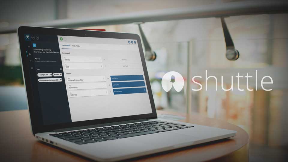
Shuttle collects, transforms and distributes data. It began as an internal tool and was being transformed into a SAAS product. When I began on the project it had a very simple user interface but was mostly a back-end tool. My role was to completely redesign the existing experience and create new flows for new features.
Headbutt Trivia

Approach

Information Architecture

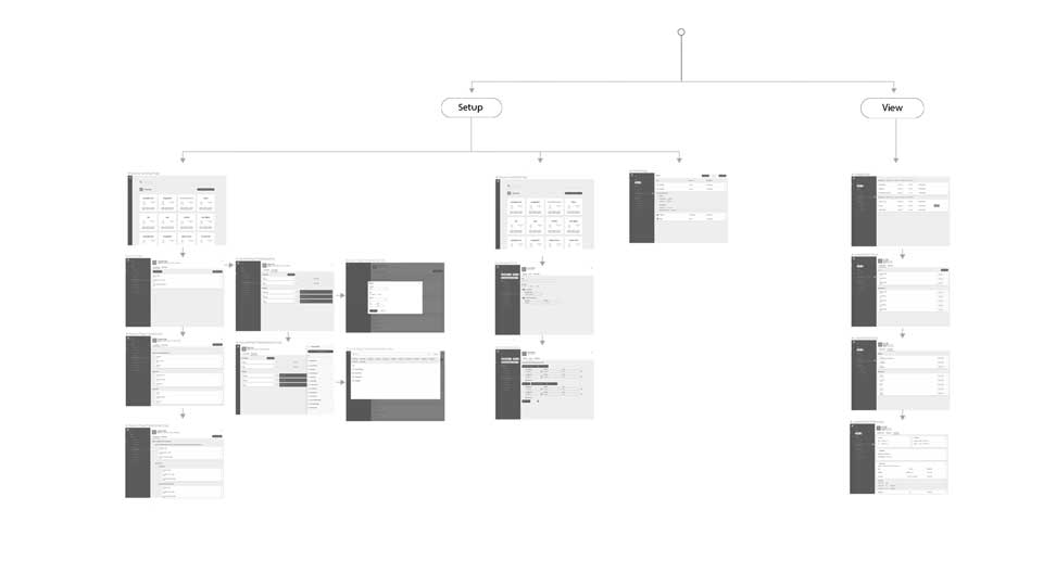
By far the biggest challenge of Shuttle was its information architecture. Early testing showed the organizational structure made it difficult to understand. Via extensive whiteboard sessions, prototyping, and additional testing the concept was simplified to sources, destinations, and leads. From that point, features could be designed around those concepts.

Shuttle Flowmap

Design

Page Structure

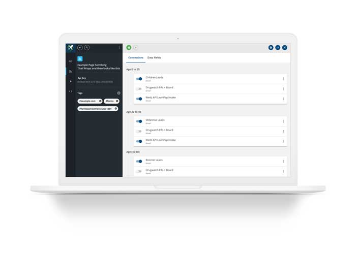
Page layouts were designed around a contextual informational section on the left and a main work area on the right. Navigational bar on the far left and header bar with contextual buttons provide consistent interactions throughout the application.

Shuttle Layout

Feature

Sidebar

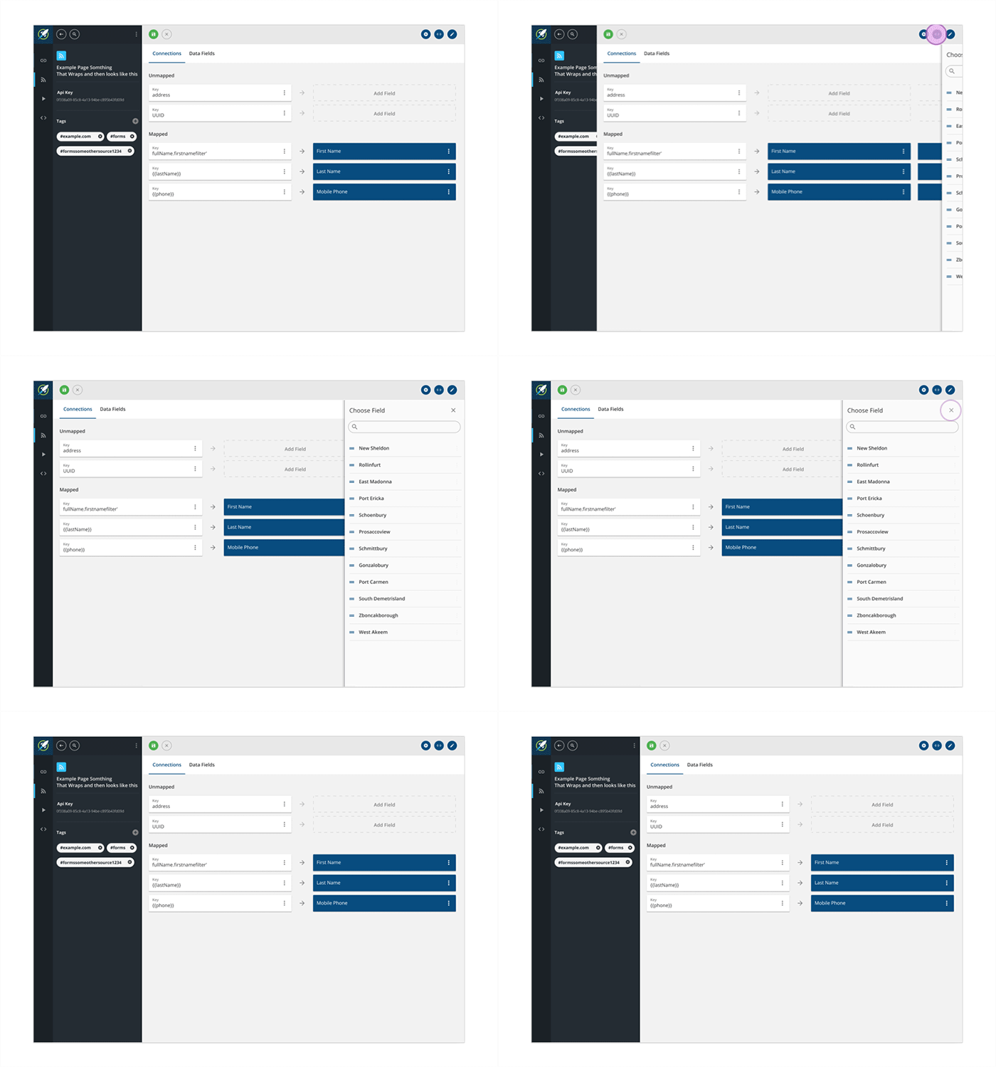
Page workflows were designed with a drag-and-drop interface via a collapsible side panel. When opening a sidebar the informational section of the page collapses to maximize available workspace.

Shuttle Layout

Feature

Materialish

Material design and flat design were combined to provide the visual inspiration for the UI.

Shuttle Layout

Feature

Tags & Filters

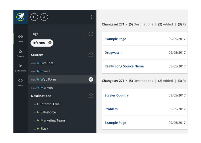
For list pages, the informational section utilize grouped filters and tags. Tags are used throughout the system to allow each user to organize their assets according to their use case.

Shuttle Filters

Process

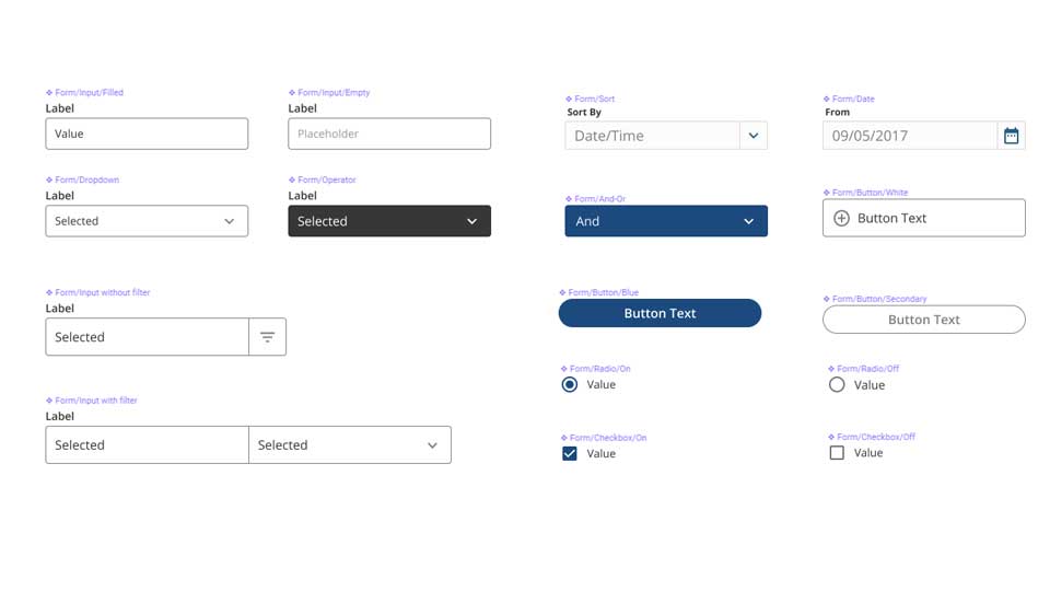
Components

By leveraging Sketch elements, components, and pages, we were able to speed up the design process, deliver more consistent UI and be more agile in our response as changes were needed. Working in a component driven method also aided in the handoff to the React development team.

Shuttle Components

Email

contact@mikenichols.me

© Mike Nichols 2019