Teebox
App design

Teebox is a mobile application to find and book golf tee times. My role was to completely redesign the search/browse experience from the ground up. Competitor apps have very similar experiences to each other so I looked for ways I could differentiate Teebox while still maintaining usability.
Approach
Two Way Scroll
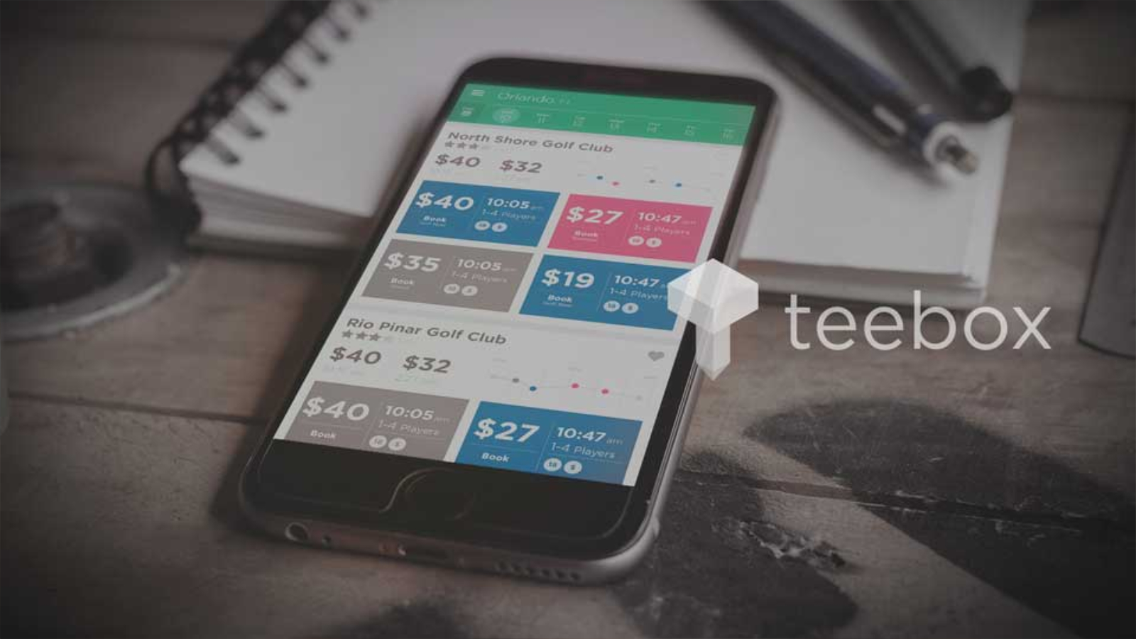
User testing made it pretty clear that users preferred tee times to be grouped by course. But to accomplish this you either needed to have very long lists or to force users to jump in and out of course 'detail' pages. Neither of these options tested very well. The solution came from having a 'two-way' scroll. Vertical scrolls between courses and horizontal scrolls between tee times within a given course. Traditionally horizontal scrolls can be frustrating, so flipbook style animation was added to provide interest and an easy way to do a stepped scroll.

Design
List
After some testing information was laid out and given weight based on its importance. A responsive price graph provides a quick way to scan prices for a given course throughout the day as well as provides a navigational cue when scrolling horizontally.

Design
Features
A type-ahead location search, filters, and favorites allow a search to be refined. A scrollable date select allows quick access but can be extended out to a full calendar if needed.
