Uplink
Lunar
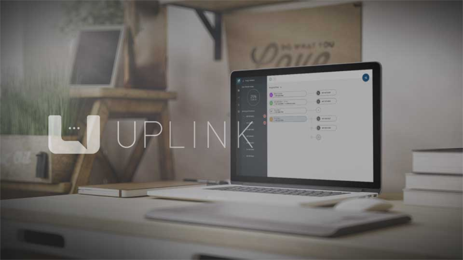
Uplink is an enterprise messaging platform I designed from concept to launch as part of the Lunar product suite. As the lead product designer, I crafted the complete user experience for both web and mobile interfaces, establishing design patterns that balanced functionality with visual impact. The platform needed to feel familiar to users accustomed to consumer messaging apps while meeting the robust requirements of business communications—including user management, number provisioning, and comprehensive activity monitoring.
Approach
Stand Out
The web app portion of Uplink exists to manage users, manage numbers, view messages, and monitor activity. With this being a brand new product and a relatively simple UI, the approach tended more towards making the design stand out. This was important for demos and to gain attention for the product.

Design
Motion
Hover effects and an animated response to drag and drop operations serve to guide and reinforce user behavior.

Messages
User Expectation
Through the design process of the message viewer section of the application, it became clear users have well-defined expectations on how the behavior should be. An example of this is the scroll direction of the message window. Testing showed users preferred the scroll to be the reverse of normal page scroll. This direction is consistent with mobile messaging applications.

Feature
Filters
The message screen utilizes filters to narrow the list of conversations. Selecting from the conversation list will display the conversation in the right-hand panel.

Feature
Activity
A filterable activity graph allows a user to see utilization quickly for a given range of time and set of employees. This provides users with valuable insights into usage patterns to help with resource planning and resource allocation.

Feature
Stacked Area Graph
The stacked area graph is color coordinated with selected employees. This allows for both a comparative view between employees and also to see how each is contributing to the total.
